Design process
I asked four Users to go through a purchase scenario up to the checkout stage. To understand their moods and thoughts, the test was monitored
Additionally, I asked for "refund" rules, since most reviews discuss refund problems earlier.

research results
- To buy a ticket, they had to pay attention many times to choose a ticket
- The forms were too long
- There is no information in some parts, such as seat and ticket selection, and it is not possible to compare them, which confuses users
- they can not find refund rules easily and there was hard to read.
I found out 2 problems, one of the user, don't set his seat while he was choose the expensive seat just for choosing seat. how that happen ?
as you can see the call to action button in left page is Check out. after the user click to the button, site will remind to choose seat but still the call to action button is go to check out so the site unpurposely lead user to go to check out without choosing seats.
refund problem
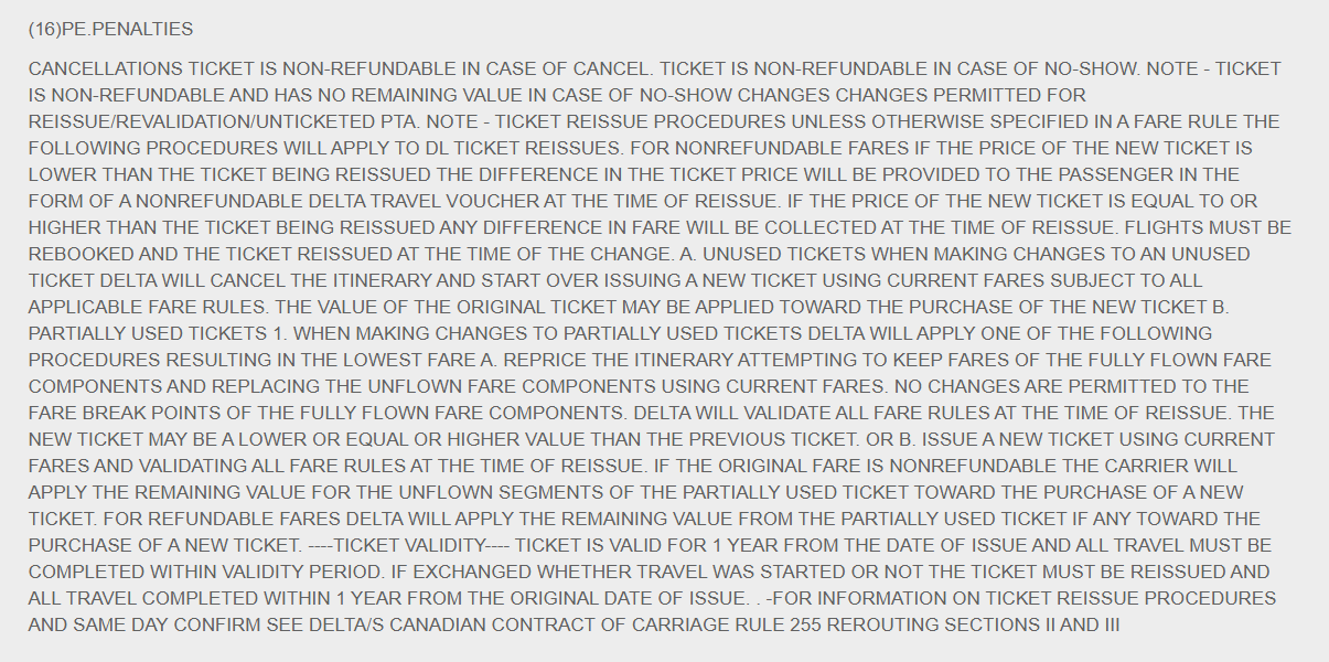
the result of research shows that most of the problems users are from refund. when I asked users to find refund page and read it. they have some difficulty, so I take a look at the page.

as you can see the refund rules are like this, ALL CAPITAL, AND ITS HARD TO READ FOR MOST PEOPLE, ESPECIALLY WHEN ITS LONG PARAGRAPH. maybe most of the users find there answer here but they are refuse to read it.
Design
In this section, we have put the list of potential features in the diagram to make the choice easier for us

Site features were placed where pinpoints existed on the site as before


The same process was repeated by four previous users, see the results:
- Three out of four users were more satisfied with the new design
- the rules were much more readable to them
- they can find refund rules easily
- they can choose tickets easily and without confusing
Conclusion
the design itself is an iterative process, and we always try to go toward better versions. in this case study I want to show another aspect of user research, The Big data, and how we, as UX designers can benefit from it. Thank you for staying with me throughout. :)


